| Fleeting Glimpse > GIF Animation Instructions > Draw | |
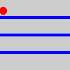
 Get ready to open your graphics program and create the images for your animation.
First, select the animation dimensions and load the web palette
|
| Draw |
step3 |
|
In this step you also need to select the colors you will use. GIF files can store only 256 colors -- these 256 colors are stored in a indexed color palette.
|
|||||||||||||||||||||||||
|
To size the image in MS Paint, select FILE|NEW. Size the image by dragging the "handles". Size is displayed in lower right corner. |
Opening a file
To open a new, empty file in Paint Shop Pro, first click on FILE then NEW. Set the HEIGHT and WIDTH size of the image in the dialog box, and for IMAGE TYPE select 256 COLOR (PSP's color palette is the same as the web palette). Click OK. If you are going to start by modifying an existing image, open the image in Paint Shop Pro. You can resize the image to the size you want by selecting IMAGE|RESIZE or by cropping. This existing image probably does not use the web palette so you need to change to it. PSP doesn't have a direct way to do this, but it's pretty easy to do. First, highlight the image by clicking on the top of its window. Now from the menu select COLORS|INCREASE DEPTH|16 MILLION if it is available (i.e. not greyed out). If it is greyed out that's ok, just keep going. Now select COLORS|DECREASE DEPTH|256 COLORS. When the dialog box appears, select STANDARD palette and check NEAREST COLOR and click OK. Now you have the web palette loaded. The colors may shift somewhat when you load the web palette but that's OK. Now you have an image file of the correct size and with the web palette loaded. You can draw in your image using colors from the web palette.
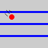
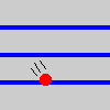
Draw the sequence of images

|
||||||||||||||||||||||||
|
The Magic Wand, Cloning tool and Replacer tool are especially useful in PSP for making animation images |
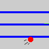
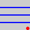
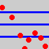 When drawing the individual frames, sometimes erasing is easier than drawing, and sometimes it helps to draw a middle image or the last image or a composite image first. For the bouncing ball animation, I first drew the composite image on the left. That way I had all the balls properly located in positions relative to one another. Next I made 8 copies of this image. When drawing the individual frames, sometimes erasing is easier than drawing, and sometimes it helps to draw a middle image or the last image or a composite image first. For the bouncing ball animation, I first drew the composite image on the left. That way I had all the balls properly located in positions relative to one another. Next I made 8 copies of this image. 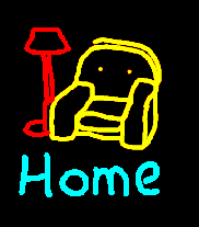 In each copy I erased all the balls except the one needed for that frame, then added in the "motion lines. For the Home animation from my homepage I drew the last image first, complete with chair, lamp and "Home", since it had all the elements and was the "composite" or foundation of the animation. To produce the other images in the sequence, I made several copies of this image (I safely saved the original in another directory) and modified them by erasing some areas (like the lamp and the word Home), repositioning others (like the chair), and adding in the moving man. This way it was easier to make sure that the shape and position of the chair and lamp were the same in each image. In each copy I erased all the balls except the one needed for that frame, then added in the "motion lines. For the Home animation from my homepage I drew the last image first, complete with chair, lamp and "Home", since it had all the elements and was the "composite" or foundation of the animation. To produce the other images in the sequence, I made several copies of this image (I safely saved the original in another directory) and modified them by erasing some areas (like the lamp and the word Home), repositioning others (like the chair), and adding in the moving man. This way it was easier to make sure that the shape and position of the chair and lamp were the same in each image.
If you are using Paint Shop Pro, you may notice that many of the filters and special effects are 'greyed out' and are not available to use. That's because GIF files only support 256 colors and you need 16 million colors for those effects to work. There are ways to use those filters in GIF files, and you can read about them in the In-Depth section. |
||||||||||||||||||||||||
|
I make a separate directory to store the images for an animation. |
Save the image files
When done drawing, save each image as a GIF file. When you save the individual images, name them with sequential numbering scheme, for example, the above images might be called BALL01.GIF, BALL02.GIF, BALL03.GIF, etc. This will be very helpful later when you assembly the animation. (for correct sequencing, start numbering with "01" not "1" if you will have more than 10 images) You've completed the basic drawing step. If you're making your first few animations I'd recommend Fast Forwarding to the next step -- Assembling the animation. But if you've successfully made a few and would like to read about transparent backgrounds, anti-alaising, tips to minimize file size and more, read on. Fast Forward >>
Optimization starts here
Drawn vs gradient vs photorealistic images
Later, I'll mention some tips for using gradient images and photorealistic images. Gradient images are drawn images that also contain gradients, including anti-aliasing, blurred drop shadows, gradients, etc. often resulting from applying filters and special effects to images drawn in graphic programs. The "stevemd's GIF animation instructions" graphic above is a gradient image since it contains anti-aliased text and a blurred drop shadow. Photorealistic images are any image that look like a photograph, or any scanned image.
Tips for optimization - managing colors and minimizing file size
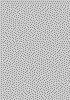
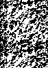
You see I hedged a bit on the last two. For drawn images the last two should always apply without exception. But when we get to gradient and photorealistic images later we may violate one or both of these guidelines, but at a price. - Areas of solid color make the smallest files. It's helpful to remember that GIF files store data by recording the changes in the pixels across a horizonal scan; the fewer changes in color across each horizonal line of the image, the smaller the file. A pattern of horizonal lines is only slighty bigger than a solid color image. But the same lines vertically produces a file three times bigger. And texture and dithering -- approximating a solid color with a speckled pattern of two other colors -- produces files 6 to 8 times bigger. The conclusion -- GIF images are most efficient when they contain relatively large areas of one color. |
||||||||||||||||||||||||
|
|
|||||||||||||||||||||||||
|
- Copying and pasting from other images: If you are going to create part of your drawing by copying and pasting from another existing image (for example, from some clipart) you must first make sure that the image you are copying from has the same palette as the image you are pasting to. If you copy from an image that doesn't have the same palette as your animation image, PaintShop Pro will dither the color; this looks bad and may increase the size of your file significantly since it adds lots of pixels of several colors. So before you copy from another image, first load the web palette into that image by selecting COLORS|LOAD PALETTE from the menu. When the dialog box appears, select the web palette file you saved earlier and and check NEAREST COLOR. Do this for every image you will be copying from. The key is to get the palette in both images to be the same before you draw, copy or paste.
- Transparent backgrounds may not compress well. Animations with transparent backgrounds that let your web page background show through. As we'll see later, these animations often don't compress as well as solid color backgrounds.
If your animation consists of a small object moving around your page and has no significant static elements in it, then a transparent background will compress well. Here's an example from Alchemy Mindwork's home page;
But if your animation has many elements or large elements, either moving or static, then a transparent background won't compress as well as a solid background (the Home animation is an example of this). My recommendation is, whenever possible, to use a solid color background in the animation that matches the web page background (specify a web color for the BGCOLOR= attribute of the BODY tag of your HTML; if you don't, it may not match your animation on 256 color video monitors). Use transparent backgrounds only when it is really necessary to achieve the look you want. |
|||||||||||||||||||||||||
|
Use comic strip tricks to imply motion; for ex. motion lines in the ball animation or the "half man" exiting the frame in the Home animation. |
If you are using a transparent background in your animation, draw your image with a transparency color that is similar to the dominant color in your web page background. That way the edges of the drawing will blend into your web page more cleanly.
- Use the fewest colors necessary. A GIF file can store up to 256 colors, and you should use as many as you need to get the look you want. But the fewer colors you actually use, the smaller the file will be later on when we compress it. Generally I try to use 16 or fewer colors (sometimes only 3 like in the bouncing ball animation). - Keep the moving elements of the animation relatively small. The more pixels that change from image to image the larger the file will be. - Don't open animation files in your graphics program: Most graphics programs, like Paint Shop Pro, do not handle GIF animation files. If you open an animation file in Paint Shop Pro it will only display the first frame. If you now save the file from PSP, it will only save the first frame and you will lose the rest of the contents of the animation. You can only view and save animation files in GIF animation software, like Gifcon and others discussed previously. - Check to make sure the palettes are right Often, as a final action is this step, I re-load the proper color palette into the image just to make sure I got the right one. |
||||||||||||||||||||||||
|
Anti-aliasing makes text smoother -- eliminates the "jaggies" |
Gradient images
The plot thickens here -- do several animations before you dig into all this. First some background, then my suggestions.
Background
The figure below compares some drawn images (Fig 1 & 2 with no filters applied -- has large areas of solid color) with some gradient images (Fig 3 & 4) produced using the anti-aliased text and blurred drop shadow filter in Paint Shop Pro. The figure shows the visual improvement and a zoomed-in view of the pixels. See all the shaded pixels in Figures 3 and 4? Those are what give the smoother appearance to the text and shadow. They are also what increase file size, increase the number of colors used, and require the use of a non-web colors. Remember, the file size increase shown in this figure is for just one image -- for an animation you could have a sequence of images, each this much larger. | ||||||||||||||||||||||||
|
|||||||||||||||||||||||||
|
Let's discuss the non-web colors produced by these effects and your options. The 256 color web palette we've used so far is rather "coarse" -- the steps between shades of color are rather large. Filters that produce gradients often need a finer gradation of shades to achieve the best looking effect -- the colors in the web palette just aren't enough. In fact, in most programs like Paint Shop Pro, you can't apply a filter to a 256 color GIF image; you must first increase the color depth to 16 million colors. But GIF files can only store 256 colors, so when you save your image for the animation you have reduce back down to 256 colors -- so which colors should you keep and which should you toss out? Using the 256 color web palette is one option, though sometimes the loss in appearance is significant. Another option is to use an "optimized" palette (also called adaptive palettes, custom palettes or superpalettes). The graphic progam makes this optimized palette by keeping the colors most used in the image and throwing out the rest. This produces the best looking image.
So you have a choice when you reduce colors in your gradient images. Either;
My conclusions and suggestions
Photorealistic Images
- Dither photorealistic images: When selecting a 256 color palette, you still have a choice between the web palette and an optimized palette. For photorealistic images, I recommend selecting the web palette since it will look best across all platforms and browsers. More importantly however, is to select DITHER (or ERROR DIFFUSION -- a specific form of dithering) and don't pick NEAREST COLOR. Photorealistic images look better dithered than with solid colors. Solid colors make photorealistic images look posterized. - Use smaller images and fewer images in the animation to keep the file size down and to compensate for the large file size of these images. - If using an optimized palette, make a global palette: As discussed previously, a global palette is important do prevent color shifts and to keep file size sown.
|
|||||||||||||||||||||||||