 |
GRDS 171
. . . Working in Values, Basics in Layout Composition in Gray Values with
Text
|
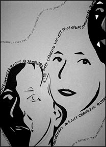
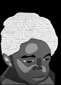
This project is divided into two major
parts:
First students develop a series of gray scales. This is
followed by developing a simple composition with text and
image in gray values.
The objectives for the first part is to introduce
students to an understanding of working with Values. The
composition then allows for an application of the values
to a photographic image.
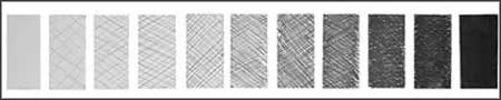
1st Developed
two Gray Scales from which to work with. The first scale
to be from either pencil or tech pen. The second scale to
be from found type (magazine or newspaper). Each scale
begins with the lightest value (benchmarked as the white)
and ends in the darkest value (the benchmark black). Nine
equal value changes need to be between (a total of 11
values) .
Seen here are examples of:
Pencil (Sarah
Meurer),
Tech Pen (Dawn
Marcoux) and
Found Type
(Jennifer Verdi)
|
 |
 |
 |
A highlight of color on a page draws the eye immediately.
When you are limited to black and white, you must be
resourceful in gaining and retaining the viewer's
attention. Contrast - the juxtaposition of dissimilar
elements - is one of the most effective ways of doing
this.
Black, white and all values between will take on
different looks depending on the medium used to create
them. This is a problem in seeing. There are many gray
between white and black, and it is not easy to see and
reproduce them in logical steps that vary only slightly
from one stage to another. (Alas!, a problem in
sequencing.)
 |
 |
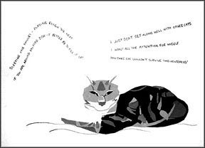 |
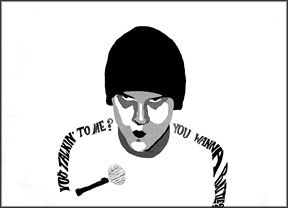
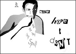
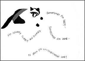
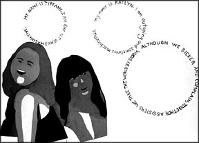
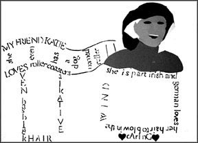
Alex Curtis
|
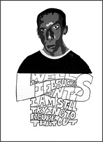
Nevin Laughlin
|
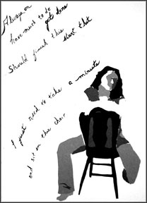
Beth Mickelinc
|
 |
 |
 |
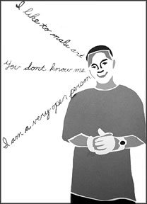
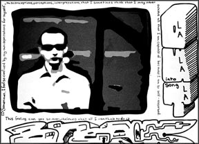
Penni Moler
|
Kris Klein
|
Eyitemi Amorighoye
|
 |
 |
 |
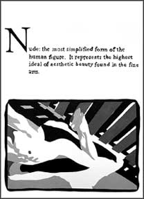
Jennifer Verdi
|
Elizabeth Reddinger
|
Kristin Harpster
|
 |
 |
 |
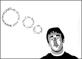
Ryan Heffner
|
Sarah Meurer
|
Matthew Boyer
|
 |
 |
 |
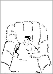
Michelle Barron
|
Robert Breckenridge
|
Cody Radcliff |
 |
 |
 |
| Evan Ayres |
James Winans |
Daphne Campbell |
 |
 |
| Alicia Knuppel |
Steve Ropelewski |
*
Permission has been given by each student to show their
work and give them credit prior to the development of
this page
|
